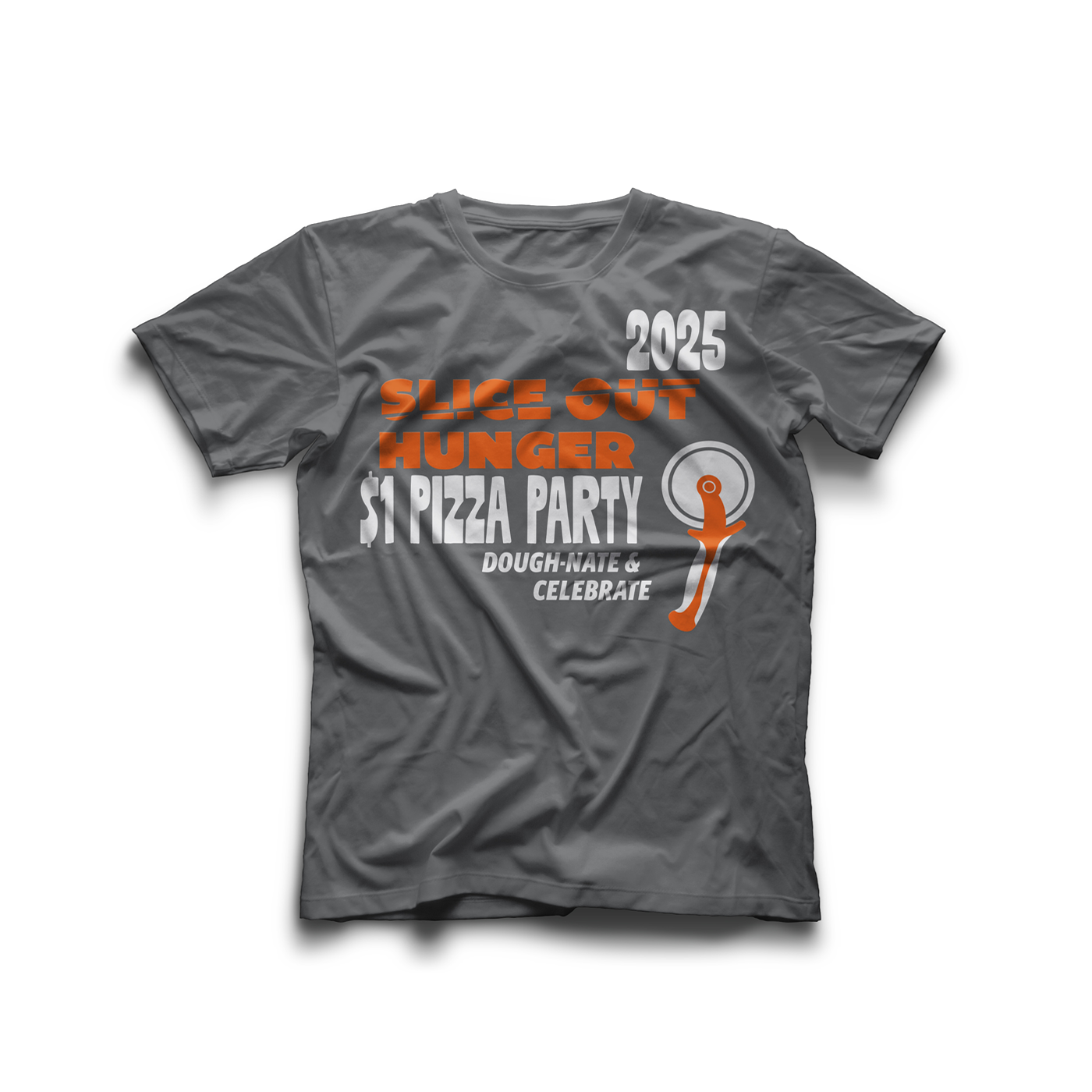
Challenge: Design a cohesive front and back shirt graphic for a non profit that effectively promotes an event while maintaining strong visual balance and readability that's color separated and ready for silk screen printing.
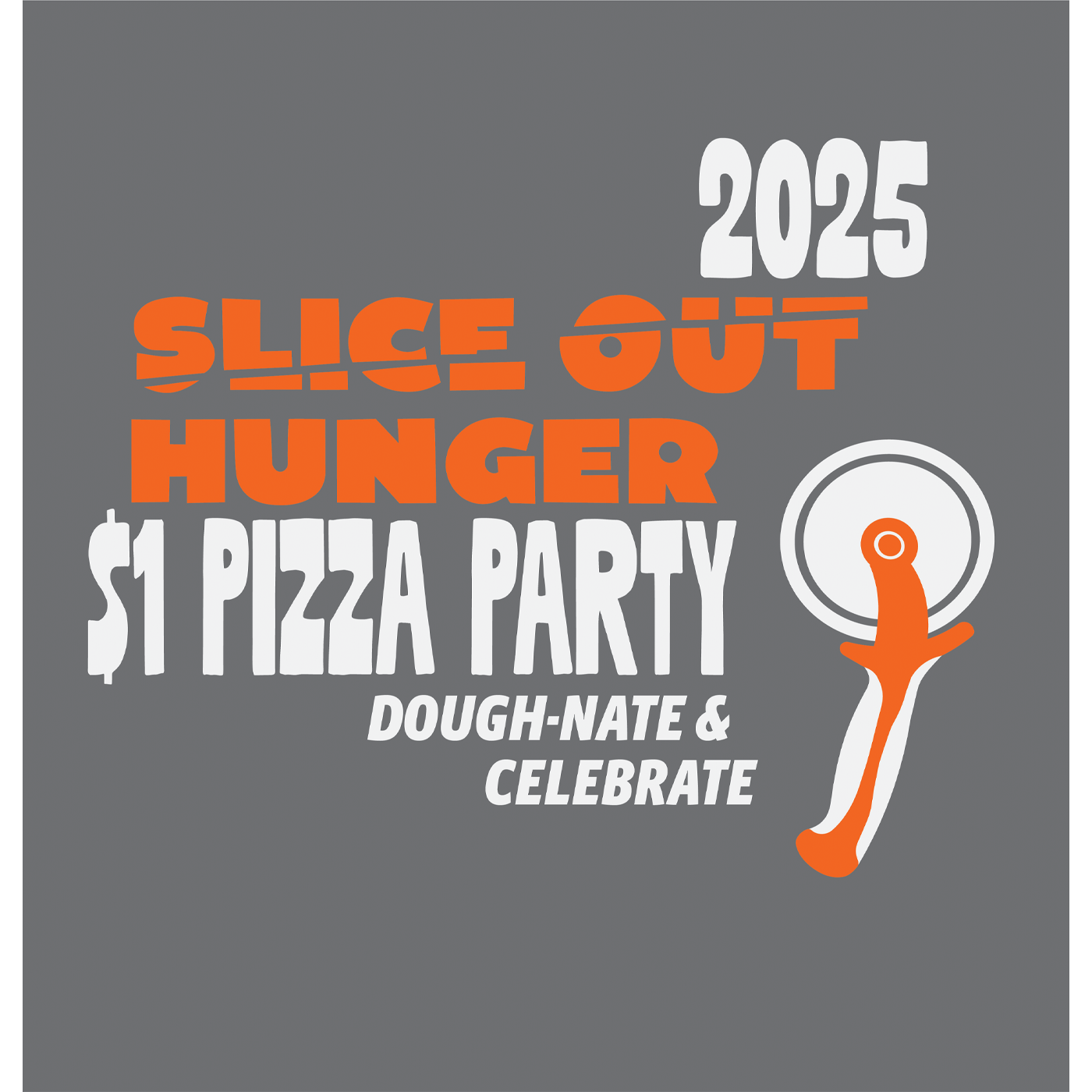
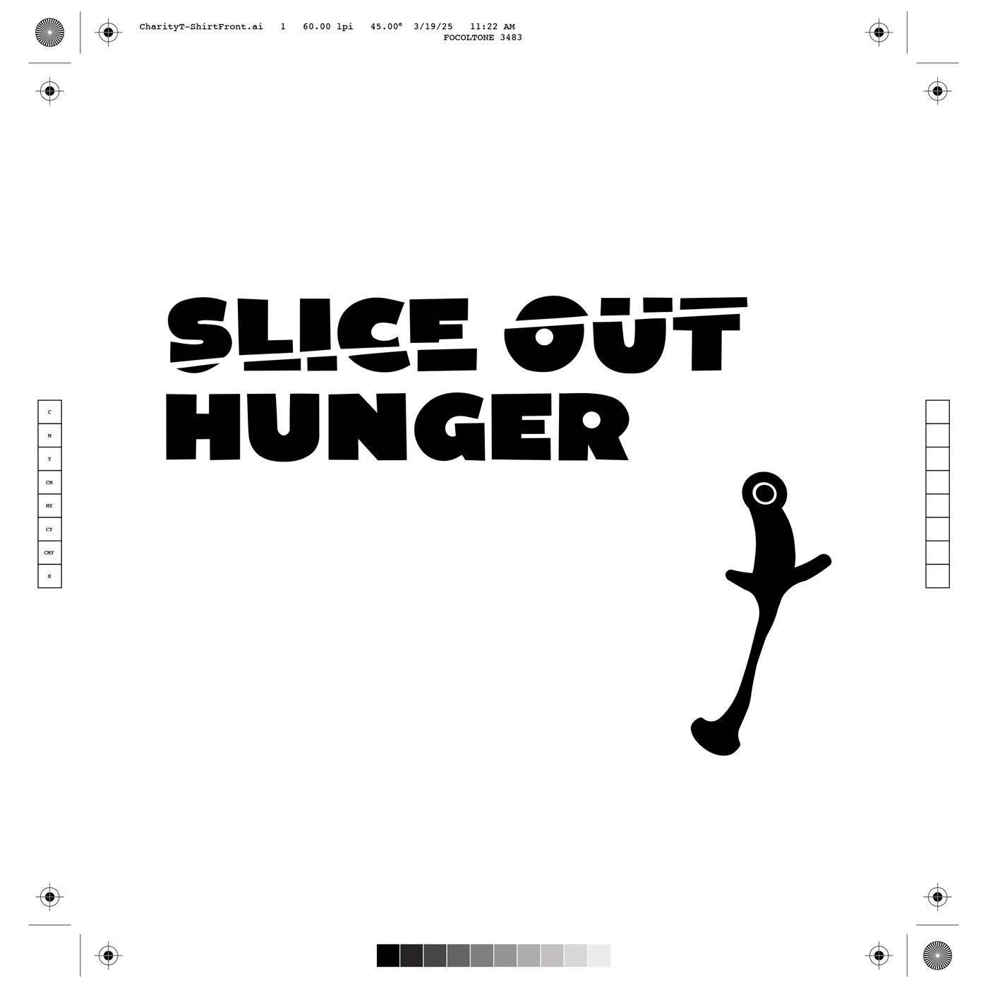
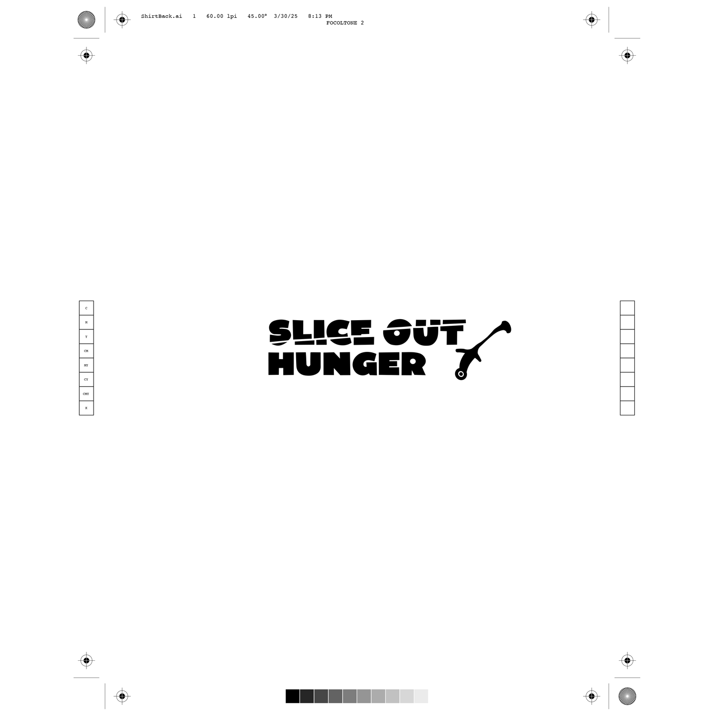
Solution: Developed a 2 color typography heavy layout incorporating the non profit organization's logo (Slice Out Hunger) paired it with a pizza wheel graphic and bold typography to emphasize the event and year, supported by a tagline / CTA "Dough-Nate & Celebrate".
Front Artwork
Back Artwork
Color Separated Artwork (Front)
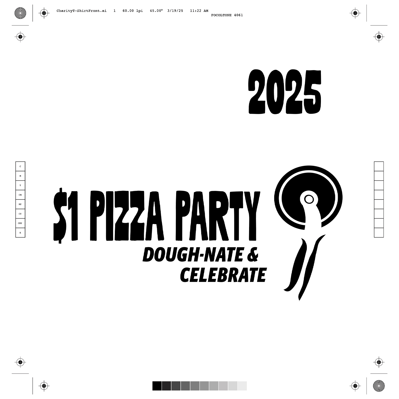
Color Separated Artwork (Back)
Mockup